
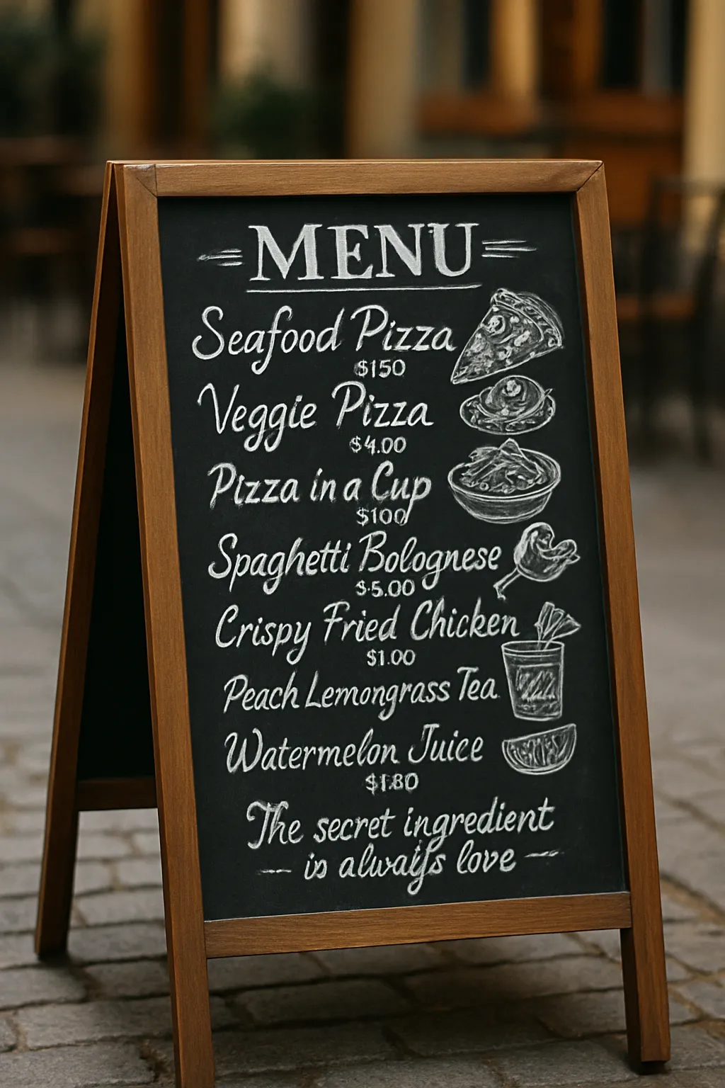
Hand-Drawn Outdoor Chalkboard Menu – European Café Style
Generate a realistic, hand-drawn chalkboard menu displayed on a wooden A-frame sign, set on a sidewalk or in a cozy European café setting. The menu features artistic chalk lettering in a mix of casual script and elegant cursive, with playful food illustrations and decorative elements. Soft natural lighting, shallow depth of field, and a subtle vignette effect create a warm and inviting atmosphere.
104Words
Private
3 Text
Prompt body
How it works
Browse and preview
Browse prompts by task or industry, and see example results and the rough cost before you run.
Run in one tap
Fill in the inputs, then hit run.
Pay with tokens
Tokens cover the AI model cost, a 10% platform fee, and a 10% author payout. Out of tokens? Subscribe or top up.
Create and earn
Publish your own prompts and get paid automatically whenever someone uses them.
Related prompts
Photography
Glamorous Vanity Reflection Portrait
621.5
Photography
Ornate Pastel Vanity Portrait
620.1
Photography
Casual City Street Portrait
617.3
Photography
Classic Denim Urban Streetside Portrait
616.9
Photography
Sleek Rooftop Cityscape Portrait
616.0
Photography
Sunlit City Balcony Portrait
615.9
Photography
Iridescent Cowboy Hat Playful Portrait
616.7
Photography
Twilight Beachfront Sunset Portrait
618.1
Photography
Classical European Balcony Elegance
615.1
Photography
Sleek Architectural Staircase Portrait
614.6
How it works
Browse and preview
Browse prompts by task or industry, and see example results and the rough cost before you run.
Run in one tap
Fill in the inputs, then hit run.
Pay with tokens
Tokens cover the AI model cost, a 10% platform fee, and a 10% author payout. Out of tokens? Subscribe or top up.
Create and earn
Publish your own prompts and get paid automatically whenever someone uses them.